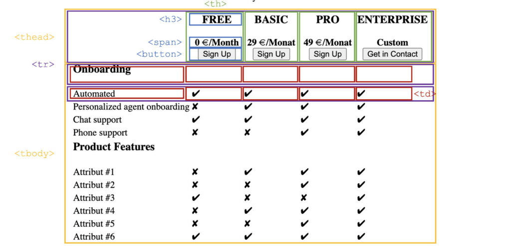
There are tons of WordPress plugins out there, which claim to provide the best pricing tables. However, the plugins usually differ less than they initially claim and often they are poorly customizable with the click-and-drop page builders. But it's not that hard to program a Responsive Pricing Table with a fixed header in pure CSS and without JavaScript.
For whom is that article: frontend developers
For whom not: designers since it’s not about the colors or appearance
To start with, it requires an usual HTML <table>.

The table consists out of the table header and table body with 5 columns. One column is reserved for the attribute description, the other four for the products.
<table class="sticky">
    <thead>
        <tr>
            <th></th>
            <th>
                <h3>FREE</h3>
                <span id="free" class="price">0 €/Month</span>
                <br>
                <button class="btn">Sign Up</button>
            </th>
            <th>
                <h3>BASIC</h3>
                <span id="basic" class="price">24 €/Month</span>
                <br>
                <button class="btn">Sign Up</button>
            </th>
            <th>
                <h3>PRO</h3>
                <span id="pro" class="price">49 €/Month</span>
                <br>
                <button class="btn">Sign Up</button>
            </th>
            <th>
                <h3>ENTERPRISE</h3>
                <span id="custom">Custom</span>
                <br>
                <button class="btn">Get in Contact</button>
            </th>
        </tr>
    </thead>

    <tbody>
        <tr>
            <td>
                <h3>Product Features</h3>
            </td>
            <td></td>
            <td></td>
            <td></td>
            <td></td>
        </tr>
        <tr>
            <td>Attribut #1</td>
            <td class="f-false">✘</td>
            <td class="f-true">✔</td>
            <td class="f-true">✔</td>
            <td class="f-true">✔</td>
        </tr>
        <tr>
            <td>Attribut #2</td>
            <td class="f-false">✘</td>
            <td class="f-false">✘</td>
            <td class="f-true">✔</td>
            <td class="f-true">✔</td>
        </tr>
    </tbody>
</table>
The entire magic comes from two lines of CSS code. When the table header hits the top of the screen, the table header becomes sticky.
.sticky th {
    position: sticky;
    top: 0;
}
The pricing table is initially made for a good product comparison. The product features or attributes and all product variants next to each other require a lot of display space. This is no big deal on desktop devices, but on smaller screens the text has to be rearranged somehow to compare the products within the table.
With the help of CSS grids, HTML elements can be positioned very flexible.
In the first step, it needs to be defined that only screens smaller than 600px make use of the new table structure.
@media only screen and (max-width: 600px) {
    ...
}
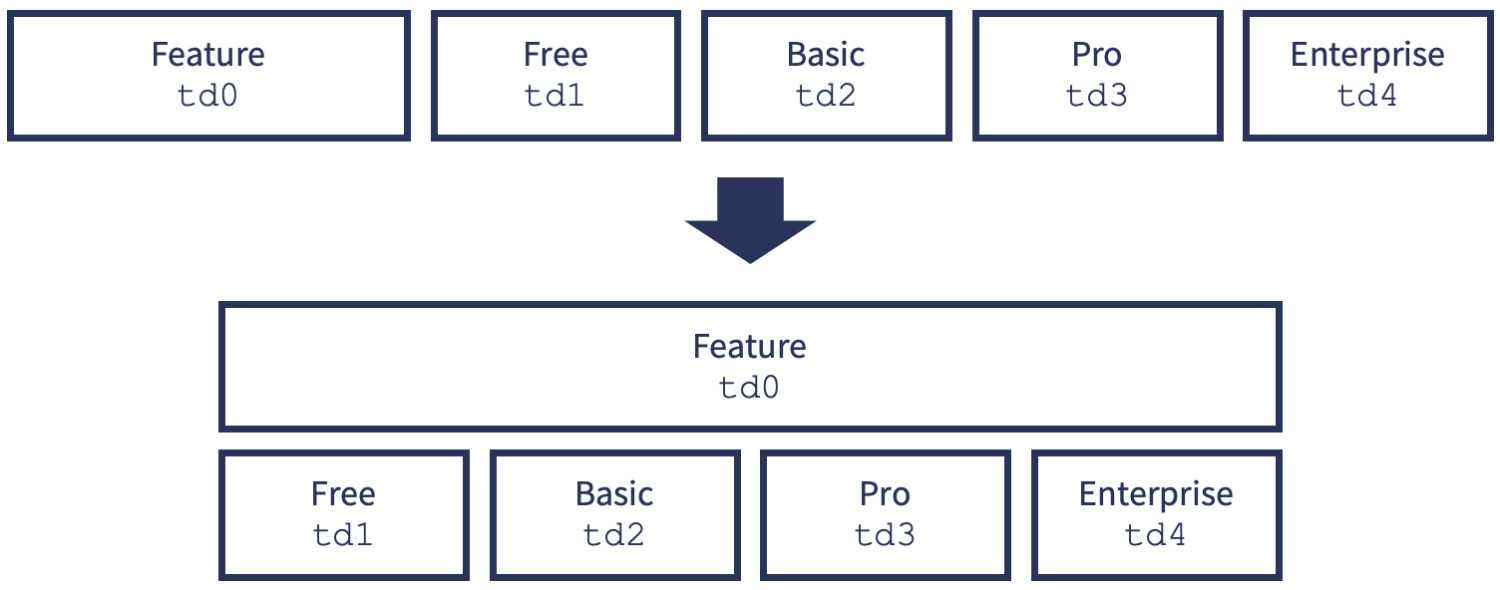
The feature description in the left column needs a lot of space. Therefore, this column should be moved to the top, where it takes up the full width of the table.

In the initial HTML code, no classes were added to the individual cells within the table row <tr> that could be used to rearrange the layout. Therefore, so-called pseudo classes :first-child and :nth-child() are used. This allows to assign CSS values to the nth child of an element (the table cells <td> in table rows <tr>). For each cell, its grid-area (e.g. td0) is defined.
.sticky thead tr th:first-child {
    display: none;
}

.sticky tr td:nth-child(1) {
    grid-area: td0;
    text-align: center;
}

.sticky tr td:nth-child(2) {
    grid-area: td1;
}

.sticky tr td:nth-child(3) {
    grid-area: td2;
}

.sticky tr td:nth-child(4) {
    grid-area: td3;
}

.sticky tr td:nth-child(5) {
    grid-area: td4;
}
Now to the most important part: The CSS Grid (each line is a separate grid) must be defined. As shown in the scheme above, each row <tr> becomes two rows (height auto) with four columns (repeat(4, fr); distributes the space evenly making all columns the same width) in the mobile grid. With grid-template-areas the layout structure can be specified, which is based on the diagram above.
.sticky tr {
    display: grid;
    grid-template-rows: auto auto;
    grid-template-columns: repeat(4, fr);
    grid-template-areas:    "td0 td0 td0 td0"
                            "td1 td2 td3 td4";
}
Ta-dah! The table is now responsive and is applicable for mobile devices.
A popular and common way to retain users for long term is to offer them long contract periods. Users who want to remain flexible can choose monthly payment for a small extra fee. The average price per month is somewhat lower when paying annually than when paying individually each month. Both prices should be displayed on the e-commerce website and toggled via a switcher.
The switch is a masked checkbox (<input type="checkbox">) which is processed by JavaScript.
Feel free to copy the CSS code for the switcher, which looks better than the plain HTML checkbox.
<div>
    <span>Monthly</span>
    <label class="switch">
        <input type="checkbox" id="checkbox-basic" checked="">
        <span class="slider round"></span>
    </label>
    <span>Annual</span>
</div>
.switch {
    position: relative;
    display: inline-block;
    width: 44px;
    height: 28px;
}

.switch input {
    opacity: 0;
    width: 0;
    height: 0;
}

.slider {
    position: absolute;
    cursor: pointer;
    top: 0;
    left: 0;
    right: 0;
    bottom: 0;
    background-color: #ccc;
    -webkit-transition: .4s;
    transition: .4s;
}

.slider:before {
    position: absolute;
    content: "";
    height: 20px;
    width: 20px;
    left: 4px;
    bottom: 4px;
    background-color: white;
    -webkit-transition: .4s;
    transition: .4s;
}

input:checked+.slider {
    background-color: #4f00ff;
}

input:focus+.slider {
    box-shadow: 0 0 1px #4f00ff;
}

input:checked+.slider:before {
    -webkit-transform: translateX(16px);
    -ms-transform: translateX(16px);
    transform: translateX(16px);
}

.slider.round {
    border-radius: 34px;
}

.slider.round:before {
    border-radius: 50%;
}
The prices can be updated using JavaScript or jQuery depending on the selection (monthly or yearly, or checked checkmark or not).
To do this, a unique ID must be assigned to the input field that jQuery listens for (in the example code id="checkbox-basic"). Use the checked keyword to auto-check the checkbox on site load and show the annual prices.
<script src="https://ajax.googleapis.com/ajax/libs/jquery/3.2.1/jquery.min.js"></script>
$(document).ready(function () {
    $('#checkbox-basic').click(function () {
        if ($(this).is(":checked")) {
            $('#basic').html('24 €/Month');
            $('#pro').html('39 €/Month');
            $('#billigperiod').html('Annual Plan');
        }
        else if ($(this).is(":not(:checked)")) {
            $('#basic').html('29 €/Month');
            $('#pro').html('49 €/Month');
            $('#billigperiod').html('Monthly Plan');
        }
    });
});
If the checkbox is checked, jQuery update the price for basic and pro product to the annual plan with slightly lower prices. If the checkbox is clicked to uncheck the input field, the monthly prices are shown.
It's that easy! Feel free to download the entire code on GitHub to play around.
If you have any questions or feedback, I'm happy to hear from you! (➞ Get in contact)
Thanks for sharing!