WordPress • WooCommerce • Mockups & Wireframes • Testing • Google Analytics
Have you ever been to a party, wedding or business event where they had a photo booth? Let me guess - it was a crowd puller. People love to take easy pictures with their friends.
Back in the days, I was looking for a photo booth for my own party, but couldn’t find a good looking one at my location. And even worse, most websites were by far outdated! Slow, non responsive and in the worst case only an email address to get in contact. I just wanted to be able to see if the photo booth were available on the date I was planning my party and book it directly - not to write emails back and forth for a couple of days
So the plan was born:
The following article is about the new Wuerzburg Fotobox website
Obviously I rent out a photo booth. But instead of a one-fits-all photo booth I thought about offering different packages. The photo booth is always the same, but we can vary with add-ons like a printer, different backgrounds and props. I came up with three packages where there is something for every budget included.
A lot of people told me about photo booths at a friend's wedding. I have been to several conventions and congresses myself where such booths were surrounded by many interested faces.
To prove myself I looked up the keywords and search volume on Ubersuggest.
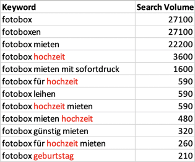
People mostly looked up photo booths (Fotobox) in combination with wedding (Hochzeit) and birthday (Geburtstag)
So I knew I had to address three potential customer groups: Beside business events also weddings and birthday parties.
Photobooths are one of the things nobody needs but everyone wants for their party.
I had the claim to create a good looking website. The Content Management System or shop platform must provide some good looking themes to start with or offer a page builder to create my own templates.
Alongside with the individual product packages, the CMS or shop platform must display some content on different pages for SEO and content marketing reasons.
And absolutely crucial: The system needs a calendar to visualize when the photo booth is available to book it directly online.
I was looking around and tested different platforms with my requirements. A few days later I was pretty sure that WordPress and WooCommerce would do the job!
All the general conditions are set and the operative planning and implementation begins.
I have seen a ton of negative examples while doing research about photobooths and rental services. But I’ve also got a ton of ideas and inspiration from other existing websites. To work in a structured way, I’ve scribbled a lot and wrote many sticky notes. I came up with hand drawn hierarchy trees and wireframes for the relevant pages. It took a couple of versions and iterations until I was happy with my drawings.
Here are my results:
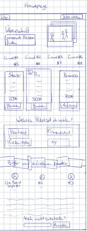
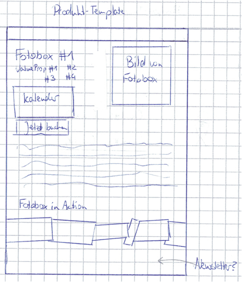
The wireframes contained all the elements that I thought were important for the moment.
To go a step further and create a real design and corporate identity, I’ve started creating mockups using Figma. But holy moly … It’s easy to work with the tool, but creating a good looking design isn’t easy at all. After hours and hours of trial and error I had produced this page:
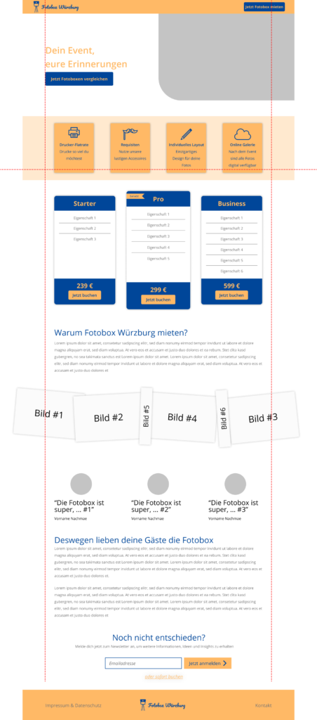
The structure was pretty clear, but the colors didn’t fit at all. And I didn’t know how to do it better and find the right style … I had to ask for help.
Fortunately a friend of mine is pretty good in UI and UX design. Christiane and I met and discussed for a couple of hours about style and branding and the personality of the website.
It took us five versions for the homepage until it was the one we were happy with.

In the meantime the new semester at university has started again and we had the chance to combine this website with an university project (Personalization with Google Optimize). For that, the team grew bigger and we had more ideas with more work power.
The new design of our website was so unique and individual that we couldn’t use an existing theme. I had bought a multisite lifetime license of OxygenBuilder for a prior project (It’s by far the best page builder I’ve used so far!!). Thus for this project I’ve decided to build the pages again with Oxygen. It’s a WYSIWYG editor with some ready made elements for WooCommerce. It’s easy to get started and drop the elements in the right place, but to style it the same as the mockup is, it takes quite a lot of effort.
Besides the static pages (homepage, faq, contact), I’ve created templates for the product and content pages. The content pages (wedding, birthday and business events) are mainly for SEO reasons and a consistent story for users coming via newsletters.
Stock WooCommerce doesn’t offer a booking calendar. There are many different additional plugins out there and I’ve tested a few. PluginHive offers a booking calendar, which does the tasks for me and is quite easily customizable with custom CSS (even in the free version). The chosen date is used as an attribute in the checkout, the order confirmation and the invoice sent via email. I don’t plan to ship the photobooth by postal service, so it’s only available in and around Würzburg (where I’m living). The photobooth set up and installation is already included in the price. If the booth is booked from a location further away but below 100 km, 0.30 € per km will be charged in addition to the price of the booked package. To calculate the new price, I’m using WebData Distance Based Fee which is based on Google Maps API.
The website is only as good as the users think it is. To improve the website, we had to test it. Svenja and Vivien, two friends of mine, have developed a test script and got some neat insights.
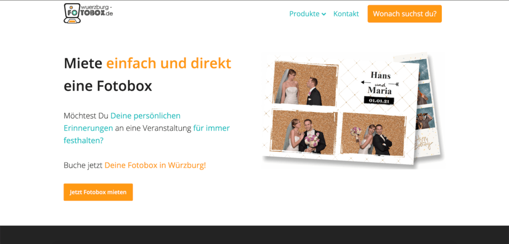
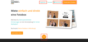
The testing users didn’t know what to expect behind the orange CTA in the menu bar (previously “What are you looking for?”). So we had to come up with a more precise wording: “Find your photobooth”. This CTA links to the step-by-step guide, which I’ve described in my post about how to address different interest groups with Google Optimize. Additionally we have changed products to offers, which fits better to the rental business. We recognized that if a user abandoned the checkout once, he can’t go back to the cart unless he adds a photo booth for a second day. For that we added a cart (= Warenkorb) item to the menu bar.
Depending on the browser screen size, it wasn’t clear to users if they can scroll down the page. Since it’s crucial for the business to show the three packages, which are below the fold, we had to be sure that people scroll down.
I’ve checked different browser sizes and found that below 700 px screen height, there’s no sign to scroll. To give users a hint, I’ve added a down-facing arrow for screens below 700 px, which hides when the user begins scrolling.
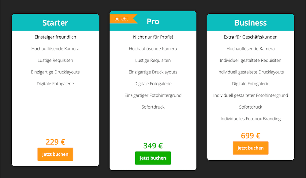
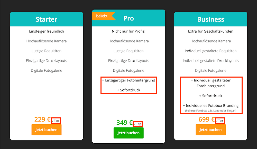
In the first version of the product packages, the difference was hard to see. To promote the additional features of the other packages, I’ve increased the font weight and added a plus sign.
Furthermore I’ve added a short explanation of what “individual photo booth branding” means (“foil-coat photo box with logo or slogan”). To make sure people understand it’s about renting the photobooth on a daily basis, I’ve added “/ day” right to the price.
Besides writing a lot of content for better ranking and asking for backlinks, there’s one more way to be more prominent in organic search: Google My Business. I have created an account and set up my three product packages, address and phone number to get in contact.
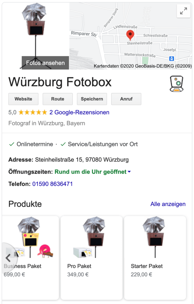
Since the photo booth is an emotional and “I-want-to-have-it” product, there is no way around Instagram and Facebook (@wuerzburgfotobox). I am absolutely new to social media as a business, but I am excited to see how it goes.
To track the performance of the site and understand which method brings the most users to the website, I’ve implemented Google Analytics via Google Tag Manager. To keep track of the different products, I’ve set up Enhanced E-Commerce Tracking with help of the plugin Google Tag Manager for WordPress.
In case I want to advertise on Facebook in the future and create look-alike audiences, I have already implemented Facebook pixel to collect data.
It would take at least an article five times as long to cover all the topics and issues I have worked on here. If you have specific questions about the website or my approach I would be happy to hear from you!
Very nice representation about your project. I like the step-by-step development of the website, from the sketch to the figma and to the real website. The whole project looks pretty easy, but obviously it not. How many days did you invest in fotobox würzburg?
Thanks Wladi!
It took me around 180 h including tool setup and team meetings.